Part 1: How to Make Charts in Google Sheets for Data Marketing
Discover 5 Simple Data Visualisations You Can Use Right Away for Your Marketing Reports
Marketing Data Visualisation
When you’re working with marketing and customer data, how you present it can really make a difference. Whether you’re managing campaigns, analysing customer insights, or keeping track of website performance, charts can help turn that raw data into something more meaningful.
In Google Sheets, there’s no shortage of charts and graphs to choose from — but not all of them are equally useful for marketing.
In this first part of a two-part series, I’ll walk you through six types of charts you can easily create in Google Sheets, with real-world examples that you can start using in your marketing today.
1. Line Chart: Perfect for Spotting Trends Over Time
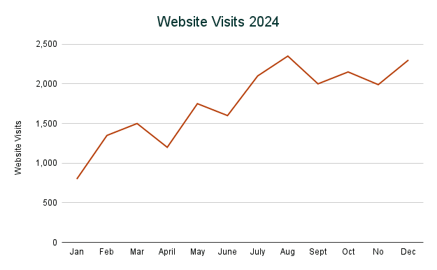
A line chart is one of the simplest but most powerful ways to visualize data trends over time. The x-axis always represents time, while the y-axis tracks a single variable (like clicks, conversions, or sales).
Marketing Use Case: Email Open Rates Over Time
Suppose you’ve sent a weekly newsletter for the past three months and want to see how your open rates have performed. A line chart makes it easy to spot patterns, dips, or spikes, showing how your audience engages with your emails over time.
Key Tips:
- Line charts work best for numerical data over time.
- Use them to highlight trends like seasonality or performance growth.
- For better insights, ensure you have a longer time frame. The more data points you include, the smoother the fluctuations and the clearer the patterns.
How to Create in Google Sheets:
- Select your time (x-axis) and variable (y-axis) data.
- Click Insert > Chart and choose Line Chart from the setup options.
- Customise the title and axis labels to clarify the chart’s focus.
2. Bar/Column Chart: Comparing Categories Side by Side
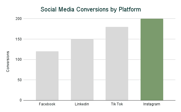
Column charts are perfect for comparing categories, such as different ad platforms, product types, or campaign channels. They display categorical data on the x-axis and numerical data on the y-axis.
Marketing Use Case: Social Media Performance Across Platforms
Say you’re running ads on Instagram, Facebook, and TikTok. A column chart can compare marketing metrics like clicks or conversions to reveal which platform performs best.
Key Tips:
- Use column charts for categorical data with distinct groups.
- Stick to a small number of categories (up to 5–7) for clarity.
- For more detail, try a stacked column chart to show subcategories within each group (e.g., device types for each platform).
How to Create in Google Sheets:
- Highlight your categories (e.g., platforms) and the numerical values (e.g., conversions).
- Click Insert > Chart and select Column Chart.
- You can double click on a bar to change the colour and make one platform stand out.
3. Pie Chart/Donut Chart: Show Proportions at a Glance
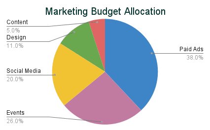
A pie chart is great for visualising how different components contribute to a whole. Each “slice” represents a percentage of the total, making it easy to grasp proportions at a glance.
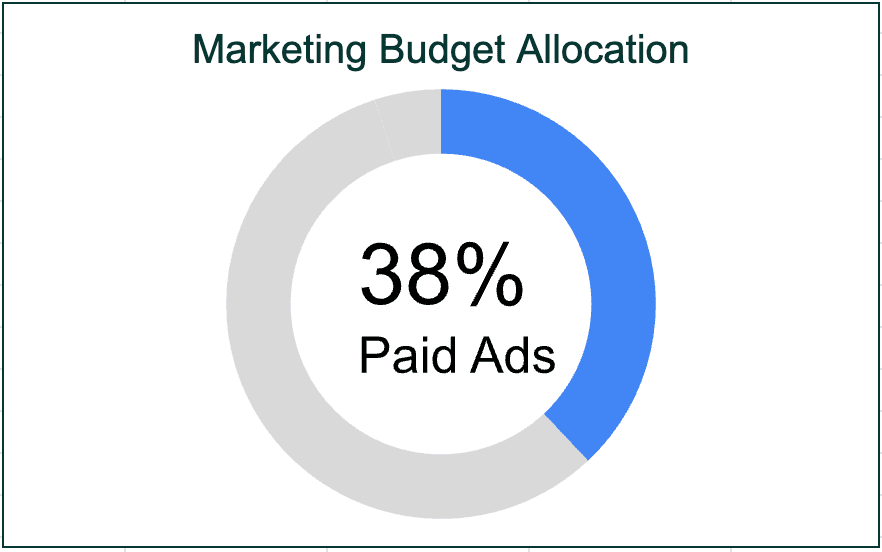
Marketing Use Case: Budget Allocation Breakdown
Imagine you’re explaining your marketing budget to a client: 40% goes to ads, 15% to content, and 20% to events. A pie chart visually breaks this down, making it easier for stakeholders to understand resource distribution.
Key Tips:
- Use pie charts sparingly; they work best for categorical data with no more than 4–5 categories.
- Avoid pie charts when the values are similar; the differences will be harder to spot.
- Label the slices directly with percentages to avoid confusion.
- Try a donut chart and emphasise one important metric in the middle.
How to Create in Google Sheets:
- Highlight your categories and their corresponding values.
- Go to Insert > Chart and choose Pie Chart.
- Use the Customise tab to add percentage labels directly on the chart.
4. Stacked Horizontal Bar Chart: Show Subcategory Contributions
Bar charts are horizontal versions of column charts, ideal for ranking data when you have long labels or want a cleaner layout. They’re especially useful for showcasing performance metrics.
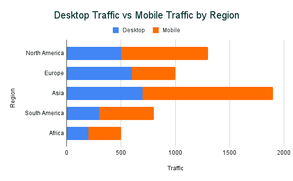
Marketing Use Case: Campaign Performance by Region and Device
A good example is analysing campaign performance across different regions. Within each region, you want to see how desktop and mobile traffic contribute to the overall performance. A stacked horizontal bar chart lets you compare total performance by region while breaking it down by device type.
Key Tips:
- Use stacked bar charts for categorical data with subcategories.
- Horizontal bars work best when category labels are long or need more space.
- Keep the number of categories manageable (5-7) to avoid clutter.
- Use contrasting colours to differentiate subcategory contributions.
How to Create in Google Sheets:
- Prepare your dataset with primary categories (e.g., regions) and subcategory values (e.g., mobile and desktop traffic).
- Highlight your data and go to Insert > Chart.
- In the Chart Editor, choose Stacked Bar Chart from the chart options.
- Customise the legend and labels to ensure it’s clear.
5. Combo Chart: Compare Two Data Sets on Different Scales
Combo charts combine two chart types (like a line and column) to compare metrics with different units, such as percentage vs. absolute numbers.
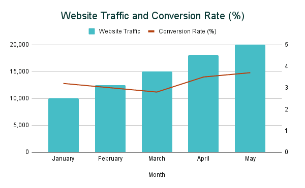
Marketing Use Case: Traffic vs. Conversion Rates
Your website traffic might double, but conversions stay flat. A combo chart overlays both metrics to show how they relate, making it easier to communicate the need for conversion rate optimisation.
Key Tips:
- Use combo charts for numerical data with distinct scales.
- Make sure each data set is clearly labeled to avoid confusion.
- Use contrasting colours or line styles for better differentiation.
How to Create in Google Sheets:
- Highlight the data for both metrics.
- Go to Insert > Chart and select Combo Chart.
- Customise one series as a column and the other as a line for contrast.
Steps to Ensure Both Metrics Are Visible:
As you can see in the chart below, the traffic on the left vertical axis are higher than the conversion rate numbers. To make the line chart for the conversions appear, you need to set up dual axes. This will add the second variable’s data on the right side of the chart.
- In the Chart Editor, go to the Customize tab.
- Expand the Series section.
- Select the Conversion Rate series.
- Check the option for Right Axis. This moves the conversion rate to a secondary y-axis on the right side of the chart.
- Adjust the scales of each axis if needed. For example:
- Traffic might range from 0 to 25,000.
- Conversion rates might range from 0% to 5%.
These six charts are just the start of what you can do with Google Sheets to visualise your marketing data.
In Part 2, we’ll dive into more advanced charts like histograms, geo maps, and tree maps—tools that’ll help you take your data analysis even further.
