Part 2: Advanced Charts in Google Sheets for Marketing Data
6 Data Visualisations to Level Up Your Reporting
In Part 1 of this series, we explored foundational charts like line and column charts that every marketer should know.
Now, let’s take it a step further. If you’re looking to uncover deeper insights or present data in creative ways, advanced charts in Google Sheets is the way to go.
1. Scatter Chart: Explore Relationships Between Variables
Scatter charts let you see how two variables interact. By plotting data points on an x-y grid, you can uncover trends, correlations, or outliers.
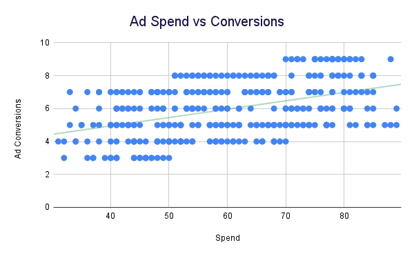
Marketing Use Case: Spend vs. Conversions
If you’re testing different ad budgets, a scatter chart shows whether increasing spend results in higher conversions — and you can also determine if you’re wasting your budget on the wrong platform.
Key Tips:
- Scatter charts are ideal for numerical data on both axes.
- Add a trendline to identify the overall relationship between the variables.
- Avoid clutter by limiting the data points to focus on the most relevant ones.
How to Create in Google Sheets:
- Highlight your two numerical data columns (e.g., ad spend and conversions). What you’re trying to predict (conversions) should go on the y axis and the variable you control (ad spend) should be on the x axis.
- Click Insert > Chart and select Scatter Chart.
- Under Customise > Series, add a trendline to visualise the pattern.
If you see all the data points moving upwards, that means there’s a positive correlation (relationship) between spend and conversions. So you can expect to capture more conversions as you increase your spend.

2. Histogram: Understand Data Distribution
Histograms show how data is distributed across predefined ranges, or “buckets.” They’re excellent for analyzing customer behavior or segmenting your audience.
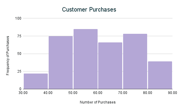
Marketing Use Case: Customer Purchase Frequency
For example, you might want to see how many customers purchase once, twice, or more within a month. A histogram helps you spot trends in purchasing behavior, guiding your retention or upselling strategies.
Key Tips:
- Use for numerical data grouped into ranges.
- Choose consistent bucket sizes to avoid skewed results.
- Ideal for understanding customer segments.
How to Create in Google Sheets:
- Select your dataset (e.g., Customer IDs and Purchase Count).
- Go to Insert > Chart and choose Histogram.
- Adjust bucket sizes under Customize > Histogram for clarity.

3. Tree Map: Show Hierarchical Data at a Glance
Tree maps visualise hierarchical data with nested rectangles, where the size of each rectangle corresponds to a metric like sales or traffic.
Marketing Use Case: Product Category Sales Breakdown
If you manage a product catalog, a tree map can show how much revenue comes from categories like “Electronics” vs. “Clothing,” helping you prioritise focus areas.
Key Tips:
- Use for parent-child relationships (e.g., categories and subcategories).
- Best for identifying which segments contribute most to the total.
- Add labels for clarity, especially with small rectangles.
- Root Node: “Product Categories” is the single root of the hierarchy. All the product categories (Retail, Food & Beverage, etc.) are subcategories of it. The Sales for this is the total of all categories.
- Parent: Retail has “Product Categories” as the parent, and the other categories have Retail as their parent.
- Sales: This column defines the size of each block in the treemap.
How to Create in Google Sheets:
- Highlight your hierarchical data (e.g., Category and Revenue).
- Insert a Tree Map via Insert > Chart.
- Customize the colour scale to match your brand or highlight key information.

4. Geo Chart: Visualise Data by Location
Geo charts display data on a map, making it easy to spot geographic trends in your audience or campaigns.
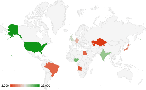
Marketing Use Case: Regional Ad Spend
If you run a global campaign, a geo chart helps you see which regions drive the most traffic or conversions, so you can allocate resources effectively.
Key Tips:
- Use for data tied to locations (e.g., countries or cities).
- Choose a consistent color scale for better readability.
- Avoid overcrowding by focusing on key regions.
How to Create in Google Sheets:
- Select your location-based data (e.g., Country and Traffic).
- Go to Insert > Chart and select Geo Chart.
- Adjust the region focus (e.g., World, Europe, or the US) for relevance.

5. Waterfall Chart: Impression Share Breakdown for Ads
Waterfall charts are an excellent way to break down your ad impression share. By visualising the total impression share and the losses due to factors like rank and budget, you can identify where improvements are needed to maximise visibility.
Marketing Use Case: Impression Share Breakdown
Let’s say your ad campaigns are capturing 60% of the available impression share. However, you’re losing impressions due to rank (25%) and budget (15%). A waterfall chart can clearly illustrate how these factors impact your total impression share.
Key Tips:
- Use this for scenarios where contributions to a total are broken down into components.
- Label the bars for clarity (e.g., “Lost to Rank”).
How to Create in Google Sheets:
- Highlight the data and go to Insert > Chart.
- Choose Waterfall Chart.
- The subtotal will appear as default. To remove it, go to Customise > Series and untick ‘Add subtotal after last value in series’.
- Add labels in Customise > Series and tick Data Labels
Now you can spot opportunities to optimise your ads.

Text content
